

Thursday, October 18, 2018
Rhodes the Titan
Monday, January 8, 2018
UNFAIR DEAL

Happy 2018!
Tuesday, January 10, 2017
Sketch Drop
Do a lot of digital sketches in-between assignments, then never finish them once I get to work. Here's a smattering I threw together.


Monday, July 25, 2016
Ashen Ones — Holloway

Gear is Sunset Helm, Xanthous Overcoat, Golden Bracelets, Deserter Trousers.
Profaned Ultra-Greatsword and Court Sorcerer's Staff.
Monday, March 21, 2016
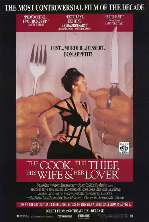
The Cook, The Thief, His Wife & Her Lover

I saw a Guardians of the Galaxy movie poster that had the tag line 'A Thief, Two Thugs, an Assassin and a Maniac', and it reminded me of the title for the movie 'The Cook, The Thief, His Wife & Her Lover.'
So I decided to do an homage. haha Here's the poster for reference. I liked that Helen Mirren's wardrobe had straps on it akin to Gamora's straps. Done in Photoshop.
Sunday, March 13, 2016
Strudelborne

Sunday, October 11, 2015
Strudel Bear Banner Process - Colors
Time to show the most time-consuming part of this banner: the colors. Oof. They took a while. So many elements and effects. So many light sources. Let's jump in.
 The FLATS.
These are the base colors for all of the objects in the piece without consideration for atmospheric effects, color composition, etc. Most of the colors here were eyedrop-sampled directly from images of the video games themselves. Other colors are placeholders for textures I would be pasting in over them, and so their colors at this stage did not matter (like the orange path that the barrel is on, the label of the NES cartridge, etc).
 The SKY / UNDERPAINTING.
This layer started out as purely a rendering for the sky. I sampled colors from photographs of sunsets, and then went to work with some chalk pastel texture brushes at a 15% opacity, just building up some forms. I am super-rusty at computer coloring, and have never been good at digital painting, so this thing took a while. After a pass, I would do a slight motion blur moving from the bottom left to the top right. Then on a separate layer, I painted over certain spots to reincorporate the coarse texture of the chalk pastel brushes. The shot below is just the underpainting and the inks, showing how the sun is setting in the classic games section and night is upon us in the next-gen section.
 As I progressed into the highlights and shadows of the piece (or as I like to call them, 'shads & higs,' which are coming up), I would turn off the flats layer to color, and I really enjoyed the look of the yellow highlights on the underpainting, so I eventually duplicated the underpainting layer and placed it overtop of my flats at a lowered opacity to get a bit of a complimentary color scheme going on between the purples and yellows. This also helped unifying all of the colors in the piece. This will make more sense as you read on, as the rest of my screen grabs will be with the underpainting layer turned on, and the flats and inks layers turned off.
 SHADOWS.
I did all of the shadows with a 50% gray tone color on a layer set to Multiply, with a brush at 15% opacity. I would build up a shadow on a selected object, then with my Polygonal Lasso tool deselect anything I wanted to keep that level of gray, and then with an Eraser tool set to 15%, would lighten up the remainder of shadow I had selected, then repeat the process two to three more times until the shadows tapered off in a way I liked.
I colored this whole piece with a mouse, which I have been informed by some of my art friends is 'crazy' and 'ridiculous.' My tablet skills are non-existent at this point, so a mouse was my only option at the time of coloring this banner. I do acknowledge that a tablet would have been faster for coloring this thing. *shrugs*
 HIGHLIGHTS! (or as I like to call them on my Photoshop layers, 'higlits' [rhymes with piglet])
This was by far the most work-intensive part of coloring this banner. Have I mentioned I was rusty at coloring yet? Anyway! Yeah, re-learning how light hits objects was a bit of a chore, and this piece had so many different sources. The left side of the piece thankfully only had the setting sun as a light source, but the darker, right side of the piece had the Dark Souls bonfire, the Bloodborne lantern, the friggin' MOON (which is the moon from Bloodborne with the Mortal Kombat logo placed inside it), and then for extra fun, I decided that the Street Fighter car would have one working headlight to create a better color balance throughout the banner, casting light and shadows on the Castle Crashers sword and shield, the dead Giant Tree from Dark Souls 2, and the Resident Evil zombie.
Much like my approach to shadows, I worked with a brush at 15% opacity over a selection of an object/objects, then would deselect portions bit by bit, and erase at 15% opacity to create gradient effects. I eyeballed the cast shadows emanating from the bonfire, lantern, and moon, but when it came to the car's headlamp, I actually made a little perspective grid to figure out how wide the light would be cast, as well as how big of a cast shadow would be produced from the 'Crashers sword.
Each of the four big light sources basically took me a whole session of coloring. I tackled one light source a day because by the time I had finished each one I was exhausted. Limbo City from DMC (underneath the big natural arch), also was its own session, but I had a very fun time figuring out how to add all of those little city lights. That one was a breeze, thankfully.
You'll also notice I added a 'majesty' effect of sunlight rays for the setting sun. In this screen grab I also include the color holds I created for the orange and blue portals from the Portal series, as well as the 'HOTEL' sign from the game LIMBO, since these objects also emit light, although I didn't actually have to create any lighting effects emanating from them.
 ADDITIONAL LIGHTING EFFECTS AND TEXTURES.
Here I added some elements that would exist over and under my shadows and highlights, as well as in some instances, my inks. The lantern got a glow effect to suggest some dust mites and debris in the dry air. Same goes for the additional lighting I put over top the headlight. I made gradients of these two things and set their layers to Noise. I flattened those layers so the effect was permanent instead of an adjustable layer setting, then I blurred them up and lowered their layers' opacities a bit. I really liked the textures this process produced, and will probably incorporate this method into non-light-source-related coloring on future pieces.
The moonlit outline of the Dark Souls crow and part of Dragon's Dogma: Dark Arisen's Blue Moon Tower was created by inverting a selection of my line art, then copying those sections of the moon from its own layer and adding a glow effect to those scraps. The layer is placed over my inks and over the Moon layer. This way the scraps of the moon will match the moon perfectly anyway, and the glow emitting from those scraps will go over my inks of Blue Moon Tower and the crow, creating a slight edge-light gradient to them, the purpose being to show that the moon's bright light bleeds around objects directly between it and the viewer.
I built up the flames of the bonfire, added a general, bright firelight aura, and some embers rising up into the night, etc.
I also painted in tree texture on the dead Giant Tree to indicate the organic nature of the vegetation and wood growing out of the petrified flesh of the giant.
Other elements include the pixelized green grass effect that I made with a green gradient and mosaic filter effect, and I added a very low opacity cobblestone texture for the ruined road in the next-gen section. Blood splatter was put over top to compliment and unify the Bloodborne, Dark Souls, and Resident Evil elements. Added a little glow to Limbo City too.

 Top row:
A screenshot of Asteroids that I built up from a smaller screenshot of Asteroids.
Wavy green lines that decorate the platforms in Super Mario 2, made from scratch.
The cartridge label for The Legend of Zelda that I recreated using a hi-res image of the strategy guide cover that I rearranged over a lo-res image of the actual cartridge's label.
The FEZ alphabet master list which I copy/pasted into the words I wanted to include on the obelisk.
Bottom row:
The checkerboard pattern from the logo of a 3-D Classics: Kid Icarus collection, made from scratch.
The checkerboard pattern from the ground in Sonic the Hedgehog, made from scratch.
The waterfall pattern from Super Mario 2 that I built up from a SUPER-low-res image from the game that I converted into a 300 dpi, indexed color file. I'm not going to pretend like I knew what I was doing here, but whatever I did worked out ok.
Finally A Tetris game I created 100% from scratch.
Here's how I did that:
 I created one block in grays to look like a Tetris square, then duplicated it into a row of squares. That row was duplicated into many rows. I made a black block and placed one in each row so that, keeping with the rules and reality of a Tetris game, none of the lines would be complete and therefore not disappear.
I made all seven shapes in a different photoshop file (pictured above), then dragged and dropped them into the piece— their layers set to multiply over the gray blocks— and puzzle-pieced the game together around all of the black blocks.
The reason I did it this way is because if the shapes already had the block texture on them and I then rotated the shapes to fit into the image, the light source of the block would rotate too, and that's not how the graphics in Tetris work. Ridiculous, I know, but fun to figure out trial-and-error-style!
Other elements are the big Bloodborne/Mortal Kombat moon made in its own photoshop file, the pixelized planet Zebes from Super Metroid on the SNES, and even after inking a version of the Throat of the World mountain from Skyrim, I opted to instead just use a snapshot of the mountain from the game, run it through a few filters, and adjust the colors to subtler hues. I honestly did not want to spend the time coloring a whole mountain covered in snow, and I liked the look of the paste-up so I rolled with it.
I did the same thing for Pit from Kid Icarus and Halo's halo. I always planned for certain objects to be ripped right from the games, so there was no hesitation in incorporating these elements once I determined what would work best for the piece.
 Those are all the effects, and so here they are with the flats turned back on. Notice that I scrapped the second moon from the inks stage, as well as the clouds behind the Ojo Del Diablos arch from Red Dead Redemption. The reason being that the second moon compositionally no longer worked with the other light sources, and I decided to recreate the clouds completely on the computer instead of paint under the line art of the clouds I drew.


These are the base colors for all of the objects in the piece without consideration for atmospheric effects, color composition, etc. Most of the colors here were eyedrop-sampled directly from images of the video games themselves. Other colors are placeholders for textures I would be pasting in over them, and so their colors at this stage did not matter (like the orange path that the barrel is on, the label of the NES cartridge, etc).

This layer started out as purely a rendering for the sky. I sampled colors from photographs of sunsets, and then went to work with some chalk pastel texture brushes at a 15% opacity, just building up some forms. I am super-rusty at computer coloring, and have never been good at digital painting, so this thing took a while. After a pass, I would do a slight motion blur moving from the bottom left to the top right. Then on a separate layer, I painted over certain spots to reincorporate the coarse texture of the chalk pastel brushes. The shot below is just the underpainting and the inks, showing how the sun is setting in the classic games section and night is upon us in the next-gen section.


I did all of the shadows with a 50% gray tone color on a layer set to Multiply, with a brush at 15% opacity. I would build up a shadow on a selected object, then with my Polygonal Lasso tool deselect anything I wanted to keep that level of gray, and then with an Eraser tool set to 15%, would lighten up the remainder of shadow I had selected, then repeat the process two to three more times until the shadows tapered off in a way I liked.
I colored this whole piece with a mouse, which I have been informed by some of my art friends is 'crazy' and 'ridiculous.' My tablet skills are non-existent at this point, so a mouse was my only option at the time of coloring this banner. I do acknowledge that a tablet would have been faster for coloring this thing. *shrugs*

This was by far the most work-intensive part of coloring this banner. Have I mentioned I was rusty at coloring yet? Anyway! Yeah, re-learning how light hits objects was a bit of a chore, and this piece had so many different sources. The left side of the piece thankfully only had the setting sun as a light source, but the darker, right side of the piece had the Dark Souls bonfire, the Bloodborne lantern, the friggin' MOON (which is the moon from Bloodborne with the Mortal Kombat logo placed inside it), and then for extra fun, I decided that the Street Fighter car would have one working headlight to create a better color balance throughout the banner, casting light and shadows on the Castle Crashers sword and shield, the dead Giant Tree from Dark Souls 2, and the Resident Evil zombie.
Much like my approach to shadows, I worked with a brush at 15% opacity over a selection of an object/objects, then would deselect portions bit by bit, and erase at 15% opacity to create gradient effects. I eyeballed the cast shadows emanating from the bonfire, lantern, and moon, but when it came to the car's headlamp, I actually made a little perspective grid to figure out how wide the light would be cast, as well as how big of a cast shadow would be produced from the 'Crashers sword.
Each of the four big light sources basically took me a whole session of coloring. I tackled one light source a day because by the time I had finished each one I was exhausted. Limbo City from DMC (underneath the big natural arch), also was its own session, but I had a very fun time figuring out how to add all of those little city lights. That one was a breeze, thankfully.
You'll also notice I added a 'majesty' effect of sunlight rays for the setting sun. In this screen grab I also include the color holds I created for the orange and blue portals from the Portal series, as well as the 'HOTEL' sign from the game LIMBO, since these objects also emit light, although I didn't actually have to create any lighting effects emanating from them.

Here I added some elements that would exist over and under my shadows and highlights, as well as in some instances, my inks. The lantern got a glow effect to suggest some dust mites and debris in the dry air. Same goes for the additional lighting I put over top the headlight. I made gradients of these two things and set their layers to Noise. I flattened those layers so the effect was permanent instead of an adjustable layer setting, then I blurred them up and lowered their layers' opacities a bit. I really liked the textures this process produced, and will probably incorporate this method into non-light-source-related coloring on future pieces.
The moonlit outline of the Dark Souls crow and part of Dragon's Dogma: Dark Arisen's Blue Moon Tower was created by inverting a selection of my line art, then copying those sections of the moon from its own layer and adding a glow effect to those scraps. The layer is placed over my inks and over the Moon layer. This way the scraps of the moon will match the moon perfectly anyway, and the glow emitting from those scraps will go over my inks of Blue Moon Tower and the crow, creating a slight edge-light gradient to them, the purpose being to show that the moon's bright light bleeds around objects directly between it and the viewer.
I built up the flames of the bonfire, added a general, bright firelight aura, and some embers rising up into the night, etc.
I also painted in tree texture on the dead Giant Tree to indicate the organic nature of the vegetation and wood growing out of the petrified flesh of the giant.
Other elements include the pixelized green grass effect that I made with a green gradient and mosaic filter effect, and I added a very low opacity cobblestone texture for the ruined road in the next-gen section. Blood splatter was put over top to compliment and unify the Bloodborne, Dark Souls, and Resident Evil elements. Added a little glow to Limbo City too.

PATTERNS & PASTE-UPS!
Video games have a lot of them!
For this piece, I built up a lot on my own and then scoured the internet for hi-res ones that I did not want to make from whole cloth. Here are the big ones:

A screenshot of Asteroids that I built up from a smaller screenshot of Asteroids.
Wavy green lines that decorate the platforms in Super Mario 2, made from scratch.
The cartridge label for The Legend of Zelda that I recreated using a hi-res image of the strategy guide cover that I rearranged over a lo-res image of the actual cartridge's label.
The FEZ alphabet master list which I copy/pasted into the words I wanted to include on the obelisk.
Bottom row:
The checkerboard pattern from the logo of a 3-D Classics: Kid Icarus collection, made from scratch.
The checkerboard pattern from the ground in Sonic the Hedgehog, made from scratch.
The waterfall pattern from Super Mario 2 that I built up from a SUPER-low-res image from the game that I converted into a 300 dpi, indexed color file. I'm not going to pretend like I knew what I was doing here, but whatever I did worked out ok.
Finally A Tetris game I created 100% from scratch.
Here's how I did that:

I made all seven shapes in a different photoshop file (pictured above), then dragged and dropped them into the piece— their layers set to multiply over the gray blocks— and puzzle-pieced the game together around all of the black blocks.
The reason I did it this way is because if the shapes already had the block texture on them and I then rotated the shapes to fit into the image, the light source of the block would rotate too, and that's not how the graphics in Tetris work. Ridiculous, I know, but fun to figure out trial-and-error-style!
Other elements are the big Bloodborne/Mortal Kombat moon made in its own photoshop file, the pixelized planet Zebes from Super Metroid on the SNES, and even after inking a version of the Throat of the World mountain from Skyrim, I opted to instead just use a snapshot of the mountain from the game, run it through a few filters, and adjust the colors to subtler hues. I honestly did not want to spend the time coloring a whole mountain covered in snow, and I liked the look of the paste-up so I rolled with it.
I did the same thing for Pit from Kid Icarus and Halo's halo. I always planned for certain objects to be ripped right from the games, so there was no hesitation in incorporating these elements once I determined what would work best for the piece.


SKY PASTE UPS!
The line art for the Asteroids game was inverted from black to white. A hi-res image of the celestial bodies Mage, Warrior, and Thief from the skills screen in Skyrim was hunted down at great length and placed, as was the regular sky map of stars from the game.

Here are the inks turned back on. Certain objects' line colors were adjusted to emphasize foreground and background, depth of field, and things like that. The Mario pipe has dark green lines, the Zelda cartridge has dark brown lines, etc.

FINAL EFFECTS.
For the Donkey Kong barrel, I made a blur effect to emphasize its movement by duplicating the finished barrel's colors and line art together into a couple different copies. Then I motion blurred both of those copies and placed one at full opacity over top of the existing barrel, and lowered the opacity of the other barrel and shifted it to the side from which the barrel is rolling to make a tracer.
Here are also the finished clouds. After deciding not to color the clouds I drew, then attempting to paint the clouds from scratch but being unhappy with the results, I opted to grab a picture of clouds, grayscale them, create a Photoshop channel that selected only the white parts, colored the selection white, then motion blur them in the same direction as the underpainting. Then on a layer beneath the cloud, I painted in some white at 15% opacity with the chalk pastel brushes to flesh out the atmospheric perspective between Limbo City and the halo in the far background.
Now it was time to throw in the titular Strudel Bear!


1. Roughs! Drawn small, scanned into the computer, adjusted in photoshop to correct any balance issues by horizontally mirroring the image and moving things around.
2. Raw inks. This is what the physical artwork looks like.
3. Cleaned up inks. Adjusted the levels, thinned out some lines. Thickened other lines. The biggest change is I re-constructed his paddy-paw toes. The way his foot pad looks changes with every drawing I do, never quite happy with the look of it. I settled on the slight arch of the toes in order to make the true sole of his foot his toe pads. Made the most sense to me. Pretty happy with the result. It's the best it's looked.
4. Flats and adjusted line art colors (dark brown for his body, gave him blue pupils, etc). I positioned Strudel Bear onto the banner, turned off all the banner layers and colored him with the underpainting layer turned on.
5. Shadows. Since Strudel Bear is positioned halfway between the old school and next-gen elements of the banner, he got a central shadow because his body would be edge-lit from both sides.
6. Highlights. Golden yellow on the left from the setting sun. On the right I went with blue, which would technically indicate moon light as the source, but in reality the decision to go blue was because it was a good contrast to pop him out on the darker side of the banner.
7. With the flats turned back on, a texture was added. I found a picture of actual strudel, extremely adjusted the levels and contrast into just black and white, then put a reddish screen over top, placed the texture on Strudel Bear, set the layer to multiply, and lowered the opacity to make the effect more subtle.
8. Line art turned back on, and a layer with a yellow glow was placed underneath everything, set to Overlay so that the background colors of the banner would come through yet still successfully make SB 'pop' over the banner art.
And heres everything put together in animated GIF form!!

Snap! Clap! Voila! And that's how the race was won!
And of course, if you want to check out my friend Brandon's twitch.tv page, you can find it and my finished banner HERE.
-Karl
Strudel Bear Banner Process - Roughs to Finished Inks
Hi! So I've never posted a process thing because frankly, it's labor-intensive! You've gotta separate your work into stages, etc, and provide a commentary?! Who has the time? SIGH. Anyway, due to how much work went into this banner for my friend Brandon's twitch.tv page, I've decided to break it down for fun:
 ROUGH LAYOUT!
Grabbed a 2-point perspective gird and roughed out the idea of Strudel Bear running past classic video games and into current-gen games. Since this was a banner for my friend's twitch.tv page, he provided me a thorough list of his history of favorite games going all the way back through the annals of video gaming, and I did my best to incorporate elements of them all into his banner. Most of the major video game elements are part of the checklist I included under the rough layout, although the list expanded and changed depending on what I felt was working and what wasn't as I got deeper into the process.


Grabbed a 2-point perspective gird and roughed out the idea of Strudel Bear running past classic video games and into current-gen games. Since this was a banner for my friend's twitch.tv page, he provided me a thorough list of his history of favorite games going all the way back through the annals of video gaming, and I did my best to incorporate elements of them all into his banner. Most of the major video game elements are part of the checklist I included under the rough layout, although the list expanded and changed depending on what I felt was working and what wasn't as I got deeper into the process.

PENCILS!
This banner is WIDE. W-I-I-I-I-I-I-IDE. This is the widest piece I've ever drawn. It's much wider than my rough. I knew this when I was sketching out the rough, as it was more for just hammering out the idea of the piece. The image area twitch's website allows for banners is very wide.
When it came to some of the more iconic, specific elements of video game-dom, I decided from the start that I would nail them more successfully by just pasting them into the image (Throat of the World from Skyrim, the Resident Evil zombie, the 8-bit faces of the Adventure Island totem pole, etc).

INKS!
This is what I committed to two 11"x17" bristol boards (smooth). I had to keep in mind the fact that a lot of work was going to be completed digitally, so I tried to only ink what needed to be included before scanning the art and completing the remainder in photoshop.
You will notice there is no Strudel Bear jumping over the barrel yet, and that is because I drew him completely separately after I finished coloring this piece, and added him in last, along with the Strudel Bear logo.

FINAL INKS.
Here are the leveled, cleaned up inks, with the remainder of digital effects added in such as a half-opacity texture on the Mario Bros. pipe, the Asteroids game in the sky, the size and placement of the Hillfigure Knoll figure was adjusted, the top of the Donkey Kong barrel was tweaked because it was too flat in my inks, and I added the cypher messages on the stone slab from FEZ (below the giant crow). The writing on the left of the slab says, "ARTWORK BY KARL SAVAGE DOT COM," and the writing on the right reads, "THE CAKE IS A LIE," which is a reference to the game Portal.
Next up is colors!
Monday, September 28, 2015
Twitch.tv/strudel_bear

I finished the banner art for my friend's Twitch.tv page - 'Strudel_Bear.' He was delighted when he saw his updated page (I even got to surprise him because he had given me his log in credentials; I set it all up on my own). I had a lot of fun making this, and I am so happy to be moving on to other projects now, finally!
Tuesday, September 22, 2015
Banner WIP

Thursday, September 3, 2015

Wednesday, August 12, 2015
Outside Smoking
Outside smoking. A nice enough man approaches me and says he is from Nigeria. He just arrived in LA two months ago. He is looking for a job and requests that I bless him. After an awkward beat where I break eye contact and look off int the middle distance as I consider what the hell is even happening right now, I reply, "Sorry. I don't think I can. I'm not religious." He repeats my answer and then goes down a list of religions. "Nope. Nope. Nope." He asks what do I believe. I motion to the sky and go, "This is it."
He takes that in, I sense a shift as he re-composes himself, then he clarifies that while that is interesting, what he meant when he asked if I could bless him was could I bless him "with cash" since he's still trying to get a job somewhere. "Sorry, I don't have any money on me," is where my sentence should have ended, but I went on to volunteer, "My job's ending in a month. I'll be looking same as you."
So then we got to talk about that for a while. "Dissolving my department" was re-explained as "closing up shop." Then he brightens up and assures me that God has a plan, etc. I politely nod again and again. "Mm hmm. Mm hmm."
I make eye contact with a driver of one of the oncoming cars let loose from the traffic light at the corner. He's giving major stink eye for no discernible reason. Maybe it's just his resting face.
He asks if I can spare a cigarette. I cannot. I leave my pack inside my apartment because I get asked so often outside on the sidewalk. I would've given him one tho, but them's the breaks.
He's a musician. He plays the congas. He sings. He's a pretty happy guy. I don't have a single thing for him and I'm done volunteering information about myself.
As he begins his wrap up, some 60-something year-old WASP-y lady in white pants and a teal blouse passes by us, proceeds up my apartment building's walkway, stands at the precipice, looks up at the second floor windows and starts shouting, "HELLO? HELLO? HELLO? HELLO? HELLO? HELLO?" I don't hear anything being said to me.
The musician from Nigeria puts his fist out for a bump. I return it. He says something about God has stuff in store for us all and we must not give up. I reply "The only way is forward. Take care." He turns and resumes walking down the sidewalk.
Inside my apartment, the chicken in my oven is now burning.
Wednesday, April 15, 2015

Thursday, April 2, 2015
Feeble Cursed Ones: Darker Days


Feeble Cursed Ones 4 (of 4)

Wednesday, April 1, 2015
Feeble Cursed Ones 3 (of 4)

Tuesday, March 31, 2015
Feeble Cursed Ones 2 (of 4)

Feeble Cursed Ones 1 (of 4)

My character Dunross from Dark Souls 2. Part 1 of 4 in my Feeble Cursed Ones: Dark Days homage to biniman's Lordran: Dark Days homage to the album art of Gorillaz' Demon Days, which itself was inspired by the album art of The Beatles' Let It Be. ^_^
Friday, March 27, 2015
Random Meshugaas
Random doodles, sketches drawn from reference, and master studies, mostly taken from my instagram, filters and all.


Wednesday, January 21, 2015
Child-Proof
"As we all know, kids will eat anything, especially pills. They will stop at nothing to get at them. It's probably due to the early-in-development appreciation for rattles, which I personally feel should be banned, but that's an argument for another day.
"Now, what else do we know about children? They're dumb. It's not their fault. It's just a question of experience. They don't know most things. But one day they WILL. However, today is not that day.
"That is why, ladies and gentlemen, I have invented and am pleased to share with you all, the child-proof cap! Surely, you're thinking, 'Child-proof cap? How?' It's simple. Yes, a child could pull a cap off. Yes, a child, given his or her druthers, could even twist a cap off. But what if the cap requires you to PUSH-- not pull-- the cap down, THEN twist and pull? Even with the instructions printed on the bottle (which I have done)-- the very solution to their problem in the palm of that child's hand-- they will not be able to 1) read those instructions, and 2) will not be capable of implementing the multi-stepped process due to their general, age-appropriate idiocy, lack of tactile coordination, and absence of patience, rationality, and critical thinking skills. My caps are a child's worst nightmare.
"I have designed several different variations of these child-proof caps and bottles that I will make available all at once to our proud populace of concerned child carers post haste, lest one more child get their hands on our adult medicines.
We have this push-down-and-turn variety that I just introduced. We have the push-in-the-sides-and-pop-the-top version for those looking for a gratifying sound to accompany a parent's delight that no child of theirs has made off with any pills. We have the hold-down-the-side-tab-of-the-bottle-before-then-unscrewing-the-cap version for those accustomed to cocking their sidearms. And for those adults who appreciate a good puzzle, I present to you the line-the-arrow-on-the-cap-with-the-arrow-on-the-neck-of-the-bottle-before-popping-the-top version.
"No child will master these medicine cap-equivalent riddles of the Sphinx. Most of you adults, I anticipate, will also be thwarted initially, and a good percentage of you possess all your faculties, fingers, and are literate. That is the brutally efficient effectiveness of my designs."
—Dr. Henry Proofenchild, M.D., inventor of the child-proof cap
Saturday, October 18, 2014

Subscribe to:
Posts (Atom)